
Case study Nonprofit
Martin’s Mission
Creating a clearer digital home for a growing faith-based nonprofit, making it easier to understand the mission, request help, get involved, and give.
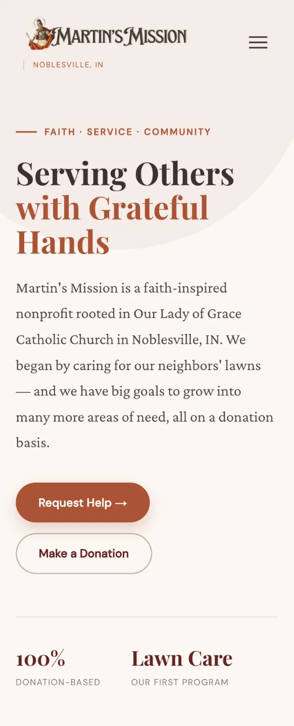
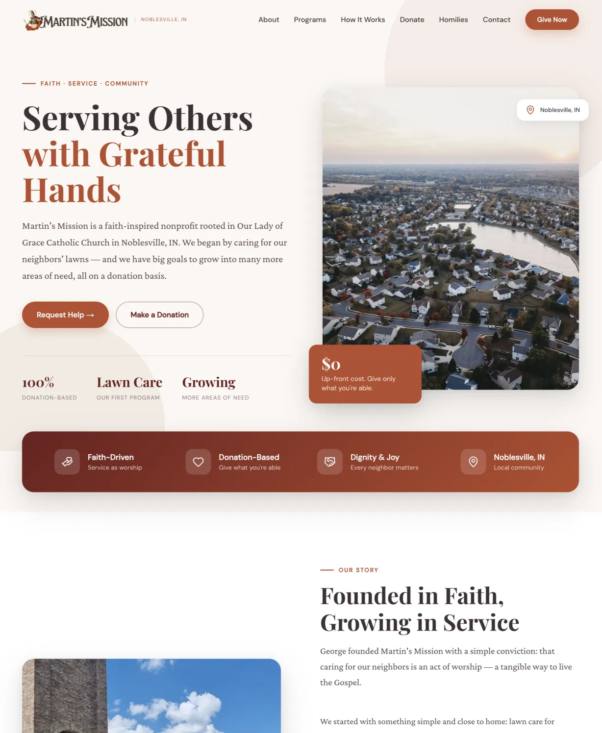
Overview
A growing mission needed a clearer digital home.
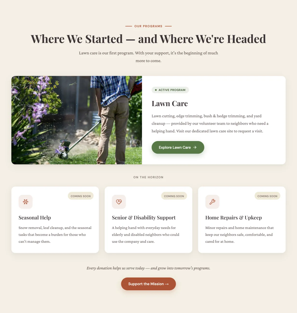
Martin's Mission is a faith-based nonprofit serving its community through practical acts of care, from lawn and home assistance to supporting neighbors facing difficult seasons. As the mission grew, its website needed to do more than explain the organization. It needed to help people understand how Martin's Mission works and where they fit within it.
The new strategic website brings the mission, programs, story, and ways to participate into one clear experience. Whether someone arrives needing help, wanting to volunteer, learning about the organization, or ready to give, the site creates an intentional path forward, while preserving the warmth, faith, and humanity at the heart of Martin's Mission.
- Client
- Martin's Mission
- Type
- Nonprofit
- Location
- Noblesville, Indiana
- Services
- Strategy, Messaging + Copywriting, UX + Website Design, Custom WordPress Development, SEO Foundations
- Timeline
- 2 Weeks
- Launched
- 2026
The challenge
One mission. Several very different reasons to visit.
-
The mission needed clarity
Martin's Mission had a meaningful story to tell, but visitors needed to understand what the organization does and why it exists quickly.
-
Different visitors needed different paths
Someone requesting help has a very different goal from someone looking to volunteer, learn about a program, or make a donation.
-
Growth needed a stronger foundation
The website needed to support a growing organization without losing the personal, community-centered feeling that makes the mission special.
What we did
Built around the people the mission serves.
-
Clarified the Mission
We brought the organization's purpose to the forefront, creating messaging that communicates both the faith behind Martin's Mission and the practical ways that faith is put into action.
-
Created Clear Paths
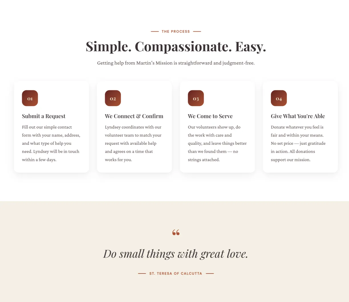
The experience was structured around visitor intent, giving people clear ways to request help, explore programs, get involved, learn the story, or make a donation.
-
Made It Human
Warm messaging, community-focused imagery, and a softer visual experience help the website feel personal and approachable rather than institutional or overly corporate.
-
Built for Growth
The new WordPress website creates a flexible digital foundation that can evolve alongside Martin's Mission as programs, stories, needs, and opportunities expand.
THE PROBLEM
The website had to serve both sides of the mission.
Most business websites have one primary audience.
Martin’s Mission is different.
Some visitors arrive because they need help. Others arrive because they want to help.
That distinction shaped the entire website strategy.
Someone facing a difficult season shouldn’t have to understand the organization’s internal structure before figuring out whether Martin’s Mission can help them. At the same time, a potential volunteer or donor needs to understand what the organization does, why the work matters, and how their involvement can make a difference.
So instead of organizing the experience solely around the organization itself, we looked at the different reasons someone might arrive and created clearer paths for each.
Receive help. Give help. Understand the mission. Support the mission.
The website needed to make all four feel natural.
POSITIONING
Leading with the heart behind the work.
Martin’s Mission isn’t simply an organization that provides services.
Its work is rooted in faith, service, and community.
That needed to be apparent without allowing the website to become so focused on the organization that the people it serves disappeared from the story.
The messaging centers the mission around serving others with grateful hands and connects that larger purpose to tangible action.
Rather than relying on broad nonprofit language about “making a difference,” the website can show what that difference actually looks like: neighbors receiving practical support, volunteers giving their time and abilities, and donors helping make that work possible.
The result is a clearer story about not only what Martin’s Mission does, but why the work exists in the first place.
USER EXPERIENCE
Every visitor needed to know where to go next.
One of the biggest UX priorities was reducing the distance between someone’s intention and their next action.
For someone who needs assistance, that means a clear path toward requesting help.
For someone interested in serving, it means understanding the available programs and ways to get involved.
For someone discovering Martin’s Mission for the first time, it means being able to learn the story and understand how the organization works before making a commitment.
And for someone ready to financially support the mission, giving shouldn’t require searching through the site to find a donation page.
Those journeys influenced the site’s navigation, page hierarchy, calls-to-action, and content structure.
The goal was simple:
Don’t make people work to figure out how to participate in the mission.
DESIGN
Warm enough to feel human. Clear enough to act.
A nonprofit website shouldn’t have to choose between telling an emotional story and creating a functional experience.
Martin’s Mission needed both.
The visual direction pairs warm, approachable typography and earthy tones with generous spacing, community imagery, and clear calls-to-action. The result feels connected to the organization’s faith and local roots without becoming visually heavy.
Throughout the site, the design creates opportunities for the mission’s story and community impact to take center stage while maintaining clear paths toward action.
And because the experience was designed responsively, those paths remain accessible whether someone discovers Martin’s Mission from a desktop computer or from their phone.
The finished website feels like the organization itself:
warm, grounded, purposeful, and ready to serve.
THE FOUNDATION
A website the mission can grow into.
The goal wasn’t simply to replace an old website with a better-looking one.
It was to create a stronger digital foundation for what Martin’s Mission is becoming.
As the organization grows, the website now has room for its programs, stories, community impact, volunteer opportunities, resources, and ways to give to grow with it.
That matters because a nonprofit’s website isn’t only a marketing asset.
It’s a connection point between the organization and the people around it, the person looking for help, the neighbor wondering how to serve, the donor deciding whether to give, and the community member discovering the mission for the first time.
The new Martin’s Mission website gives each of them a clearer place to begin.
The finished site
Gallery
Have a project like this?
Tell me what your business does and where the current site falls short. I'll come back with a plan and a flat price.
View all work