
Case study Waste Management
B&L Disposal
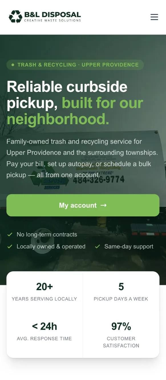
What began as a website refresh became a connected digital platform, bringing B&L's public website, resident account experience, and internal billing operations together in one system.
Overview
MORE THAN A WEBSITE REFRESH.
B&L Disposal originally came to At The Meridian for a website refresh and a better way to organize information for residents across the communities it serves.
But one part of the business presented a much larger opportunity.
In addition to waste collection, B&L was responsible for managing the residential billing experience for approximately 3,400 residents in one of its service areas, from quarterly invoices and mailed statements to online payments, checks, account records, and support requests.
The project quickly became bigger than redesigning a public-facing website.
We needed to think about three connected experiences: the public website residents use to find information, the account portal residents use to manage their service, and the internal system B&L uses to manage the operation behind it.
- Client
- B&L Disposal
- Type
- Waste Management
- Location
- Pennsylvania
- Services
- UX Strategy, Strategic Website Design, Information Architecture, Custom Development, Resident Portal, Admin Portal, Billing + Payment Systems, Customer Support Workflows
- Timeline
- On Going
- Launched
- 2026
The challenge
3,400 RESIDENTS. 17 TOWNSHIPS. THREE VERY DIFFERENT USER NEEDS.
-
Residents Needed Answers
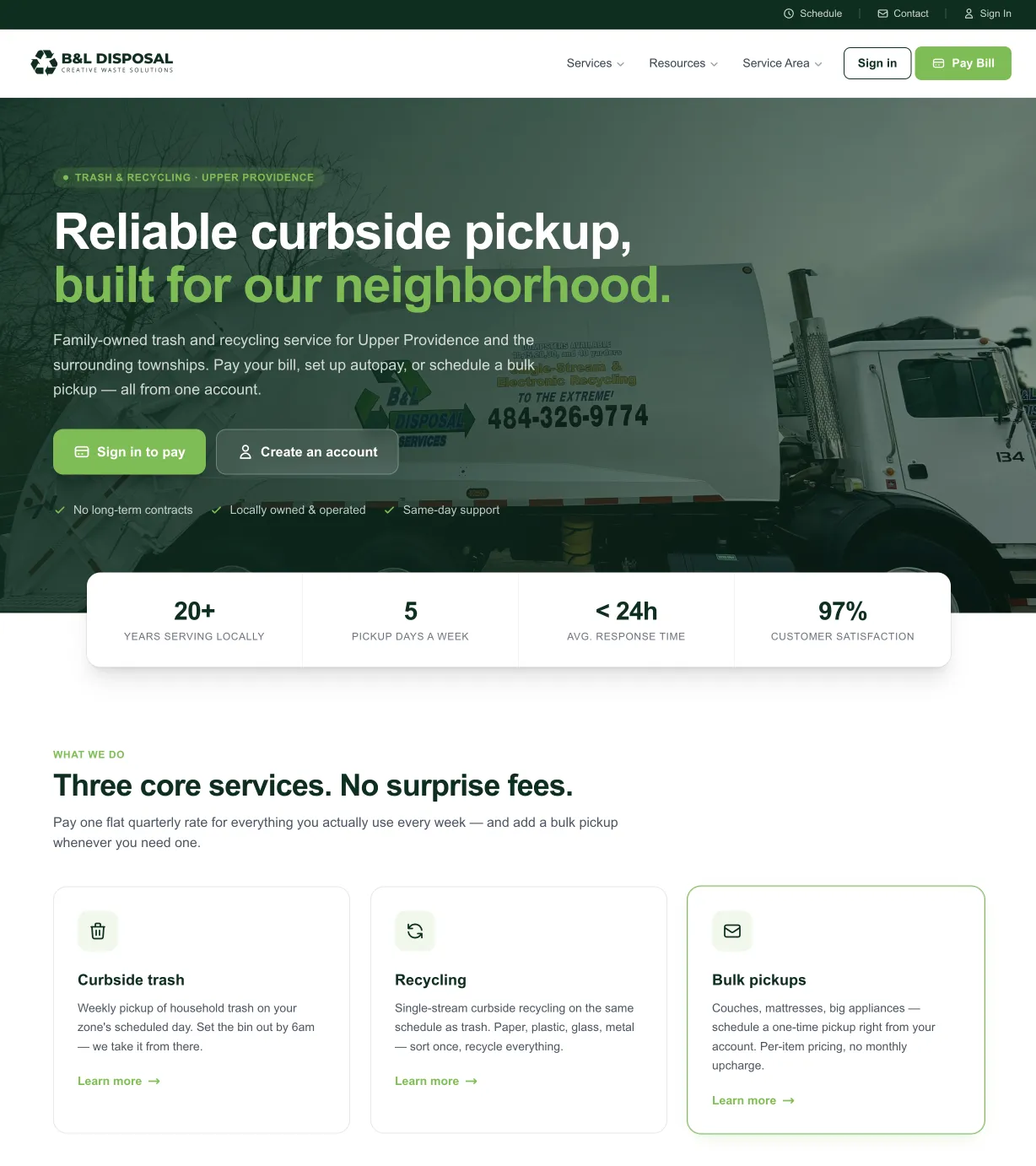
Customers needed an easier way to find pickup information, recycling rules, bulk-item guidance, holiday schedules, billing information, FAQs, and township-specific resources without contacting the office for every question. The current resource system now brings many of those recurring needs into one place.
-
Residents Needed an Account
A one-time online payment wasn't enough. Residents needed access to invoices, payment history, payment methods, autopay, account information, and service requests in one connected experience.
-
B&L Needed to Manage It All
Behind every customer-facing interaction was an administrative one. B&L needed tools to manage resident records, billing, invoices, payment activity, mailed invoices, customer information, and support without relying on disconnected processes.
What we did
The challenge wasn't designing three separate systems. It was making all three work together.
-
THE PUBLIC WEBSITE
Information without the runaround. We reorganized B&L's public-facing strategic website around the information residents and prospective customers actually need. Services, service areas, pickup information, recycling guidance, bulk-item rules, hazardous waste, seasonal information, FAQs, billing resources, and support are structured into clearer paths instead of forcing customers to hunt for answers. The result is a website that doesn't just market B&L. It helps B&L serve people before they ever pick up the phone.
-
THE RESIDENT PORTAL
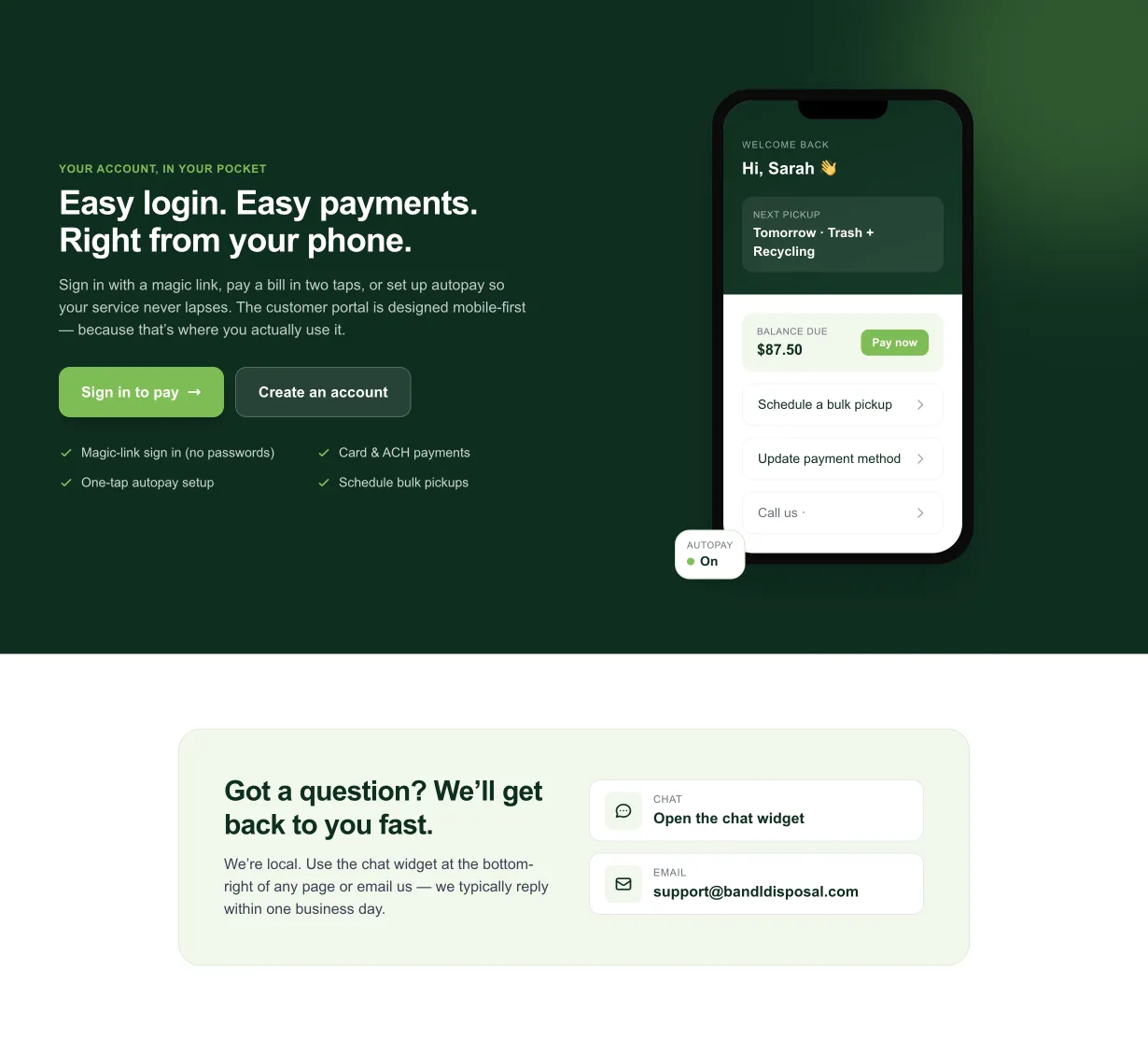
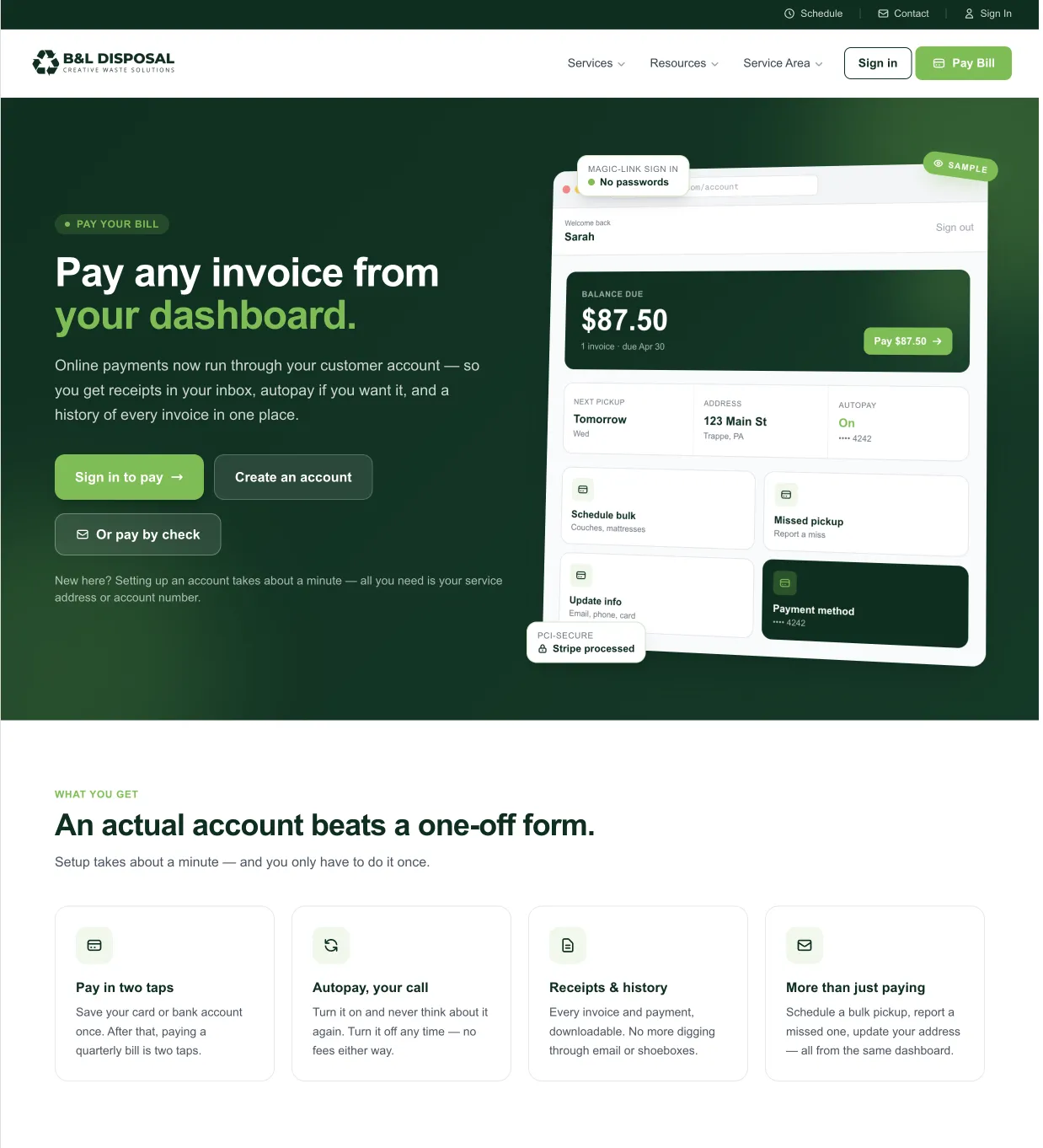
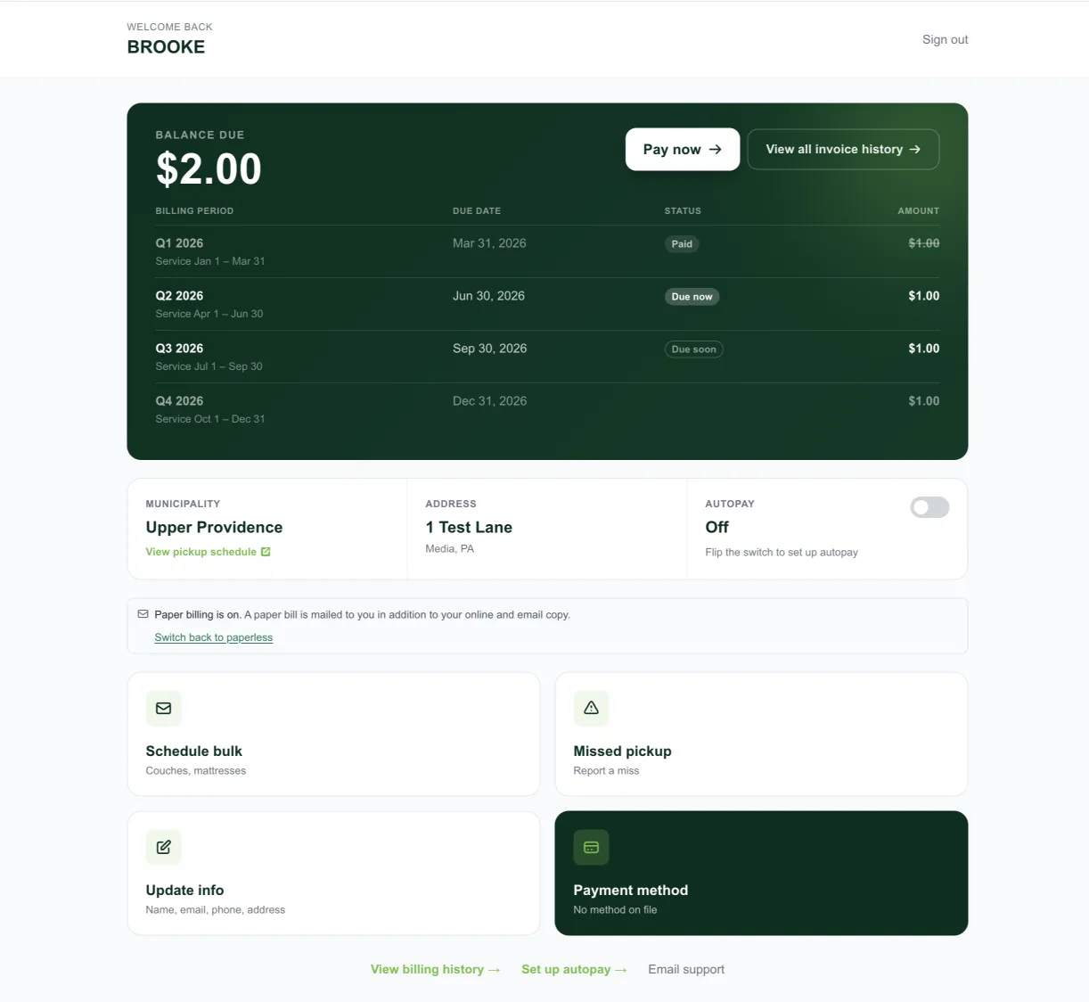
An actual account, not another payment form. For the residents whose billing B&L manages, we created a customer account experience around the ongoing relationship rather than a single transaction. Residents can access their accounts, view invoices and payment history, pay by card or ACH, manage payment information, use autopay, report missed pickups, schedule bulk services, and update account information. The current portal uses magic-link authentication so residents don't have another password to remember. The result is one place for residents to manage their relationship with B&L.
-
THE ADMIN PORTAL
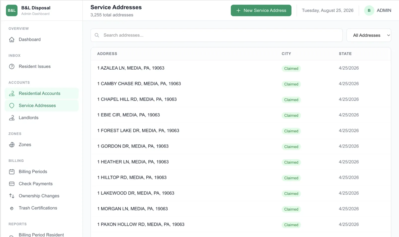
The system behind the customer experience. The resident experience could only work if B&L had an equally capable system behind it. We built the administrative side around the actual work B&L needed to manage: resident accounts, invoices, billing records, online payments, checks, mailed invoices, customer information, and support activity. Instead of building customer-facing features in isolation, we considered what needed to happen on both sides of every interaction. A resident makes a payment. B&L needs the record. An invoice is generated. The resident needs to receive it, and B&L needs to know its status. A customer has a question. The support team needs enough account information to resolve it. The front end and back end were designed as parts of the same experience.
THE STRATEGY
WE STOPPED THINKING ABOUT PAGES AND STARTED THINKING ABOUT PEOPLE.
This project had multiple users with completely different goals.
A prospective commercial customer might be asking:
“Does B&L provide the service I need?”
A resident might be asking:
“When is my trash picked up?”
Another might need:
“I need to pay my quarterly bill.”
And someone inside B&L might need:
“Which residents still have an outstanding invoice?”
Those shouldn’t all lead to the same experience.
So the information architecture was built around tasks and users, not simply around a traditional website navigation.
That distinction ultimately shaped everything from the public content structure to the resident dashboard and administrative workflows.
BILLING
THE PAYMENT WAS ONLY ONE PART OF THE PROBLEM.
One of the biggest strategic shifts was recognizing that online payment and online account management are not the same thing.
A simple payment form can collect money.
But B&L was managing an ongoing quarterly billing relationship with thousands of residents.
That requires more.
Residents needed to know what they owed, which invoice they were paying, whether a payment had been received, what they’d paid previously, and how they wanted to pay going forward.
B&L needed those transactions connected back to the correct customer and invoice.
The resident portal now brings invoices, payments, receipts, payment history, card and ACH options, and autopay into a single account experience.
We weren’t simply making it easier to collect a payment. We were designing the billing experience around the relationship.
INFORMATION ARCHITECTURE
17 TOWNSHIPS SHOULDN'T MEAN 17 DIFFERENT PLACES TO LOOK.
B&L’s service area created another UX challenge.
The company currently serves 17 townships, and collection rules and schedules can vary by municipality.
Residents don’t care how the information is organized internally.
They just want to know:
When is my pickup?
Can I throw this away?
Does B&L take this item?
Does the holiday change my schedule?
Who do I contact?
So we built the public information experience around those questions while creating paths back to township-specific information when necessary.
The result is a resource system designed around finding an answer, rather than understanding B&L’s organizational structure.
UX / SUPPORT
SOMETIMES THE BEST SUPPORT REQUEST IS THE ONE THAT NEVER NEEDS TO BE SENT.
This project also changed how we thought about conversion.
On a marketing page, success may mean getting someone to submit a form.
For an existing B&L resident, success might mean the exact opposite.
If someone can find their pickup information, understand a recycling rule, pay an invoice, retrieve a receipt, report a missed pickup, or manage their account without needing help, the strategic website has done its job.
And when someone does need the B&L team, support forms can collect account numbers, service addresses, and the type of issue so the request arrives with more useful context.
Good UX doesn’t eliminate customer service. It lets customer service spend more time on the problems that actually need a person.
The finished site
Gallery
Have a project like this?
Tell me what your business does and where the current site falls short. I'll come back with a plan and a flat price.
View all work